|
EXHIBITION TEXT:
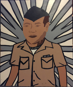
Isabel Santiago George, September 2015 Acrylic on plywood The artist of this particular piece, Isabel Santiago, set out to create a military based painting, with a bit of inspiration, using acrylic paints. The intention of this painting was to create someone important in her life in her own way. Inspired by Aloysius Patrimonio's Navy Sailor Rifle Binoculars Retro, her painting George captures the look of her loved one. Although this painting was quite time consuming, her visions were captured. |
|
PLANNING:
BACKGROUND COLOR: The background color option was between gray and white, like my inspiration, or navy blue and white, since this is a gentleman who is in the navy. OUTFIT CHOICE: Since the men and women in the navy have four different outfits that they wear, it was really up to me to decide which outfit would look best on the background that I chose. OUTLINING: Originally, the plan was not to outline anything, but further thinking it through, to create a piece with a pop-art feel, outlining everything in this painting made most sense. |
|
|
PROCESS:
To paint the background was a difficult task to overcome. It was tough to choose whether to paint the sailor first or the background first. After deciding the paint the background first, it was another tough decision to paint the white or gray first, so for no specific reason, I chose the gray first. Then, I taped off the spaces in which I didn't want to be painted white, using painter's tape. The next step was to paint the white and peel off the tape. That idea, however, did not work in my favor since I let the paint dry. Letting the paint dry made it so it dried on the tape as well, so when I pulled off the tape, I also pulled off chunks of paint that should have remained. |
After peeling off paint that was supposed to be left in tact, I had to flip around the board to the point where when I painted the sailor over the top, it would cover up the chipped paint. It worked out well in my favor because I then positioned the arms to cover up the parts that the body did not. This way, I was able to make the sailor take up the majority of the board and leave very little extra space compared to the piece I used as my inspiration. |
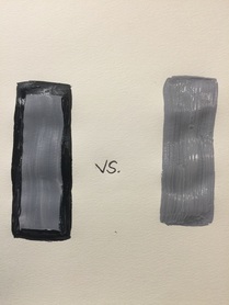
Outline vs untouched
|
DEVELOPING IDEAS:
After completing the painting without outlining a single thing, I realized that the piece felt incomplete. So, I decided to outline only the sailor and his uniform, but doing so made the background feel incomplete as well. After deciding to outline the white and gray stripes in the background, the piece was beginning to come together. After doing this, I also felt as if the lines were a bit more defined as well. |
|
ARTIST INSPIRATION:
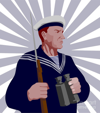
My artist inspiration to create "George" came from a piece named "Navy Sailor Rifle Binoculars Retro" created by an artist named Aloysius Patrimonio. All of his artwork is created with technology, since he specializes in Digital Art. Due to the fact of his work being digital, the majority of his work is cartoon-like. The fact that he uses a sailor as the main focus completely sparked my interest, mainly because of the fact that before I came across Patrimonio's piece, I already knew I wanted to created a sailor dressed in his Service Khakis, or NSU's. My piece is similar to "Navy Sailor Rifle Binoculars Retro" specifically because of the background that both that piece has and the background which I've created myself for "George." Although his background was also gray and white, in just about the same layout as mine, I outline everything in my piece to give it a "Pop-Art" feel. The artwork I used as inspiration is displayed to the right. |
|
|
MEANING:
The sole purpose of creating "George" was because of the fact that my significant other joined the navy. I began working on this piece only shortly after seeing him for the first time in months. While he was away, it was extremely hard to cope with the fact that he wasn't around, or even that I wasn't able to contact him much. Overall, I decided to create this painting because seeing my man in uniform was ultimately the best feeling I've ever felt. I had never known what it was like to be so proud of someone until this moment. |
REFLECTION:
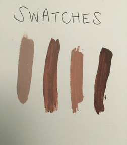
Overall, this piece was like any else. There were many obstacles to overcome, but they were just minor bumps in the road. The absolute biggest issue with this painting was the background. At first, I did not know how to tackle it, or even where to begin. The toughest decision was to either paint it white to begin with, then after tape was applied, paint the gray- or vise versa. In the end, what I chose worked just as fine as the other would have. Creating different skin tones was also another major obstacle to overcome, but in the end it, too, worked out just fine. I'm satisfied with the way this painting turned out overall. It makes me even happier that it didn't really turn out to look like Aloysius Patrimonio's piece. |
